Using reports
When you open a report, a graph and a table are displayed. They show different views of the same data.
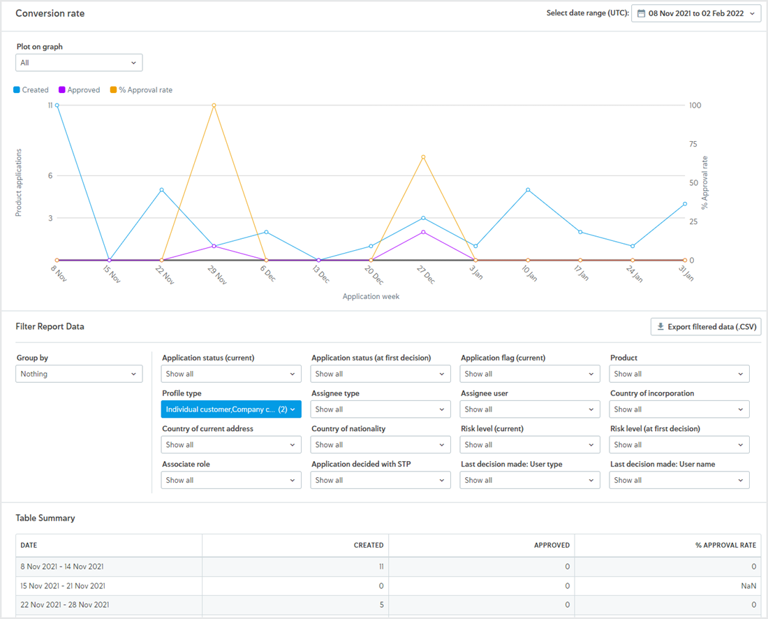
The dates on the graph's timeline show the first Monday of each week, aside from the exceptions described in About the data where data begins or ends midweek.
Watch the video
This video takes you through the basics of using reports to analyze your compliance processes. You'll see an example of the Straight-Through Processing (STP) report, including how to change the date range, filter and group data, and export data so you can work with it in Excel, Google Sheets, or plug it into your own analysis tools.
About the data
There are a few important things to note about the data:
Most data is available from 1 September 2018 onward.
Data for Risk level (at first decision) is only available from 19 September 2019 onward. Data for Straight through processing (STP) is only available from 24 July 2019 onward.
The data for your account is refreshed every day between 2:00 AM - 4:00 AM UTC. Reports can still be used during this time. If the date range for the report includes today, you may see some data for the previous day. For example, new applications may have been created or application statuses may have changed since the data was refreshed.
The graph and table start with the first week in the date range that has data and end with the last week in the date range that has data. For example, if you're looking at the Time to decision report and you select a date range that starts with the first week of January and ends with the last week of December but applications were only decided between April 1st and April 30th, the timeline for the graph starts with 1 Apr and ends with 30 Apr.
Changing the plot lines on the graph
To change which lines are plotted on the graph, open the drop-down and select your option.
The available plot lines depend on the report. To learn more, see Application reports, Task reports, Check reports, and the Audit metrics report.
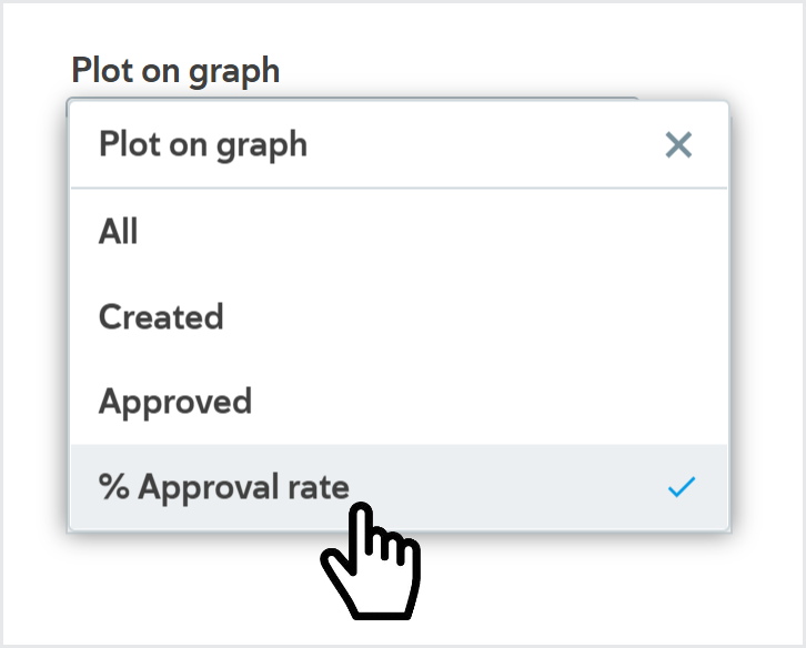
Changing the plot lines on the graph does not affect the data in the table.
Select a date range
All the available data for the last 12 weeks is displayed by default.
To change the time range:
Open the drop-down.

Select a new start date from the Select start date calendar.
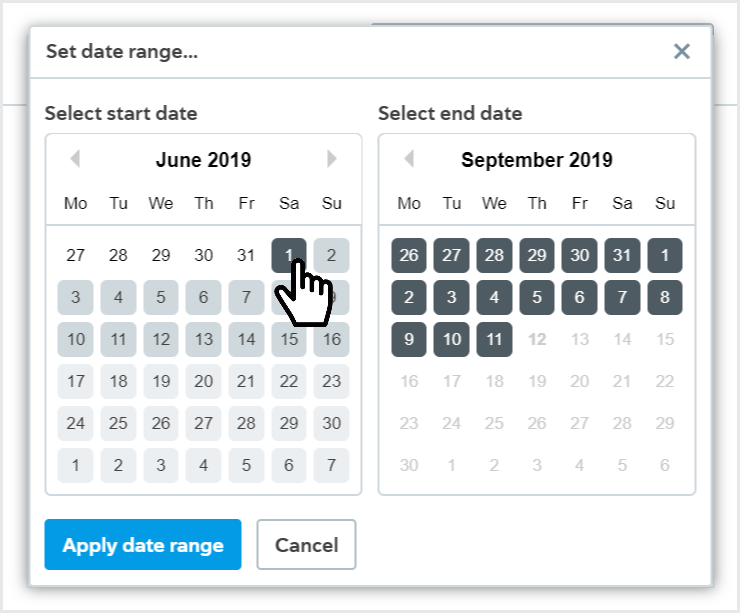
Select a new end date from the Select end date calendar.
Select .
The data for your date range is displayed.
The graph and table start with the first week in the date range that has data and end with the last week in the date range that has data.
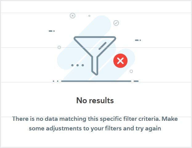
If no applications were created in the given time range, the graph displays a message to say there are no results.
Report data refreshes daily, so if your date range includes today, you may see some data for the previous day. Learn when your data refreshes. Days are determined by Coordinated Universal Time (UTC). Use the arrows next to the month to change months in the Select start date or Select end date calendar.
Filter report data
To view applications that meet specific criteria only, filter your data.
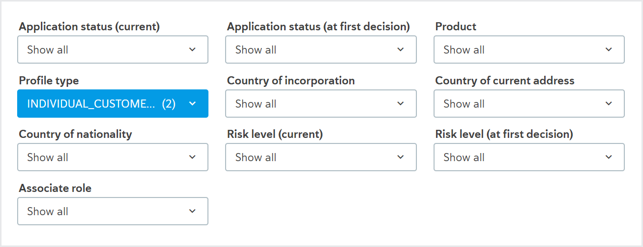
The filter criteria that are available depend on the report. To learn more, see Application reports, Task reports, Check reports, and the Audit metrics report.
Apply a filter
To apply a filter to your data, click the drop-down for one of the criteria under Filter Report Data and select the options you want to apply.
As you select options, the data is filtered automatically.
Follow the same steps to add as many filter criteria as you like.
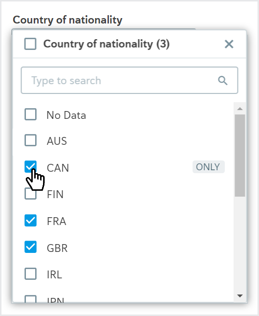
Filter criteria with many options have a search tool in the drop-down so it's easy to find what you're looking for.
Remove a filter
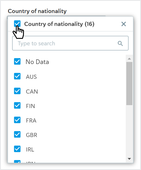
To remove all options for a filter criterion, click the drop-down for the criterion and select the first option. This option has the name of the filter criterion, for example, "Country of nationality".
When you click the option, all filtering for that criterion is removed from the data.
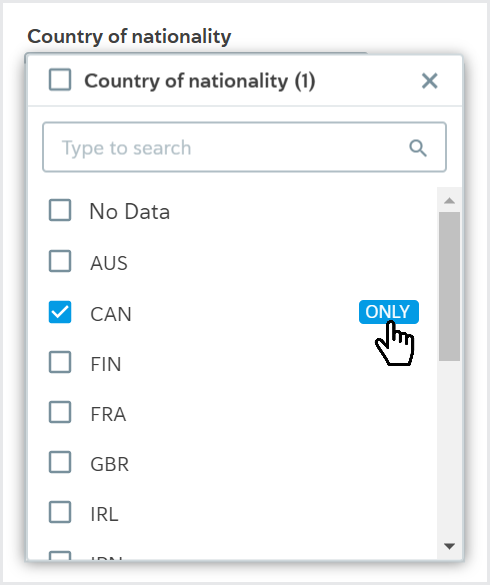
You can also remove all options for a filter criterion except one. To do this, click the drop-down for the filter criterion, hover over the option you want to keep, and select .
When you select , all other filtering options for that criterion are removed from the data.
Group report data
To see a segment of your data in detail and compare it, use the Group by feature.
For example, if you're looking at an application Time to decision report, you can group by Product to compare how applications for two of your products are performing.
The Group by options that are available depend on the report. To learn more, see Application reports, Task reports, and Check reports.
Apply a group
To apply a group, open the drop-down and select any option, for example, .
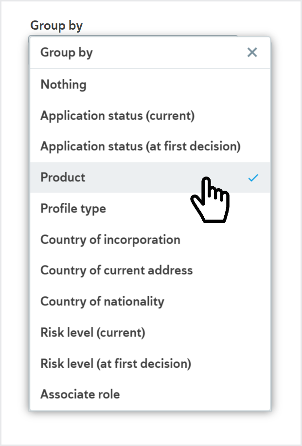
The table and the graph are updated with your selection.
This is still the same data selection you were viewing before. Any filter criteria are still applied to your data, and the time range stays the same.
How the table changes
The first column of the table displays your group selection as the first column. For example, if you're looking at an application Time to decision report and you select , the first column of the table displays the names of your products.
The other columns show the same metrics as before but specific to each row in the table.

In this example, the Time to decision report is grouped by Product. During the date range, 50% of the applications made for a Forexo Basic Account were decided in three minutes and one second. By contrast, 50% of the applications made for a Forexo Pro Account were decided in 46 minutes and 47 seconds.
How the graph changes
The graph is re-plotted with one plot line for each element of your group.

In this example, the Time to decision report is grouped by Product. The plot lines on the graph are:
Forexo Pro Account - 50th percentile: The time it took for 50% of the Forexo Pro Account product applications approved/rejected that week to be decided.
Forexo Pro Account - 80th percentile: The time it took for 80% of the Forexo Pro Account product applications approved/rejected that week to be decided.
Forexo Pro Account - 95th percentile: The time it took for 95% of the Forexo Pro Account product applications approved/rejected that week to be decided.
Forexo Basic Account - 50th percentile: The time it took for 50% of the Forexo Basic Account product applications approved/rejected that week to be decided.
Forexo Basic Account - 80th percentile: The time it took for 80% of the Forexo Basic Account product applications approved/rejected that week to be decided.
Forexo Basic Account - 95th percentile: The time it took for 95% of the Forexo Basic Account product applications approved/rejected that week to be decided.
The graph always starts with the first week in the given date range that has data and ends with the last week in the given date range that has data.
To keep the graph readable:
If you view all plot lines and your selection has more than 3 groups, the first 3 rows in the table are plotted.
If you selected a single plot line using the Plot on graph option, the first 10 rows of the table are plotted.
To plot specific groups, select them from the filter criteria. For example, if you grouped your data by Product and you have more than three products, the first three products in the table are plotted. If you're interested in comparing two products, select those products from the Product filter and they'll be plotted on the graph.
No results
If you see a message that says No results, there's no application data that matches your date range and filter criteria.
Try using a different date range or changing your filter criteria.
Report data refreshes daily, so if your date range includes today, you may see some data for the previous day. Learn when your data refreshes.
Saving and sharing reports
You can copy the URL and save it or share it.
Anyone with Read-only or Read and write access for the All reports permission. will see that report when they follow the link.
If you select a date range and/or apply filter criteria or groups before copying the URL, your options are applied when the URL is followed.
Exporting report data
You can download a copy of the raw report data with the date range and any filter criteria applied as a CSV file.
You need Read-only access for the Export data permission to download the data.
To export the data:
Select . A dialog is displayed with all the data you can export.
The data is grouped into the following categories: Standard profile data, Custom fields, and Decision reasons. The raw data contains more information than is displayed in the graph and table. To learn what data can be exported for your report, see Application reports, Task reports, Check reports, and the Audit metrics report.
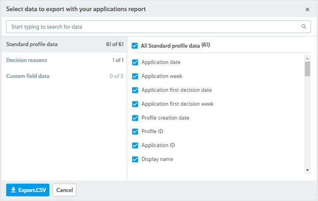
Select the data you would like to export. To see data from a different category, select the name of the category. You can also use the search tool at the top of the dialog to search for specific data.
Select . A message is displayed to say your report is being generated. While your report is being generated, you can do other things in Passfort.
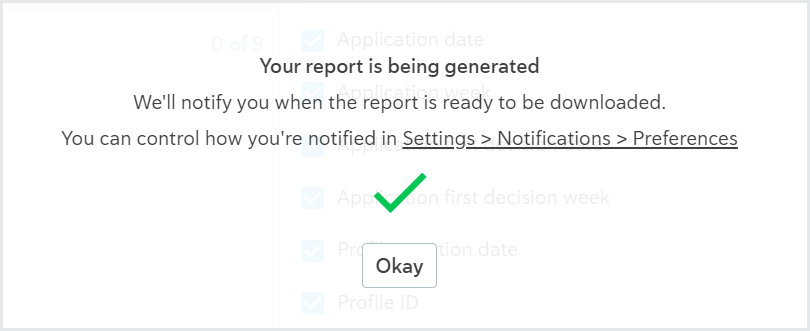
Select the button. The way you can get your report depends on which settings you have for the A report I requested completes notification preference:
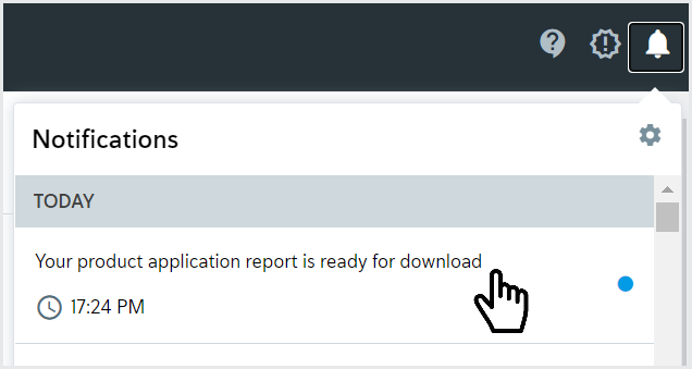
If you have selected In Passfort, a new notification is displayed. Select the Notifications icon
 to see all notifications, then select the notification that says, Your product application report is ready for download.
If you have selected By email, you'll receive an email to say your report is ready for download. In the email, select .
A ZIP file is downloaded. It contains a CSV file of the raw data you selected. Each row in the file corresponds to one product application created during the report's date range.
You can open the file in Excel or any other CSV-compatible application.
Five reports at a time can be generated for your company's Passfort account. CSV files can only be generated for reports with tables that have 300,000 rows or fewer. You can reduce the number of rows in your report table by changing the date range or applying filters. The CSV file uses UTF-8 encoding, so it displays correctly in almost all environments. If you see unexpected characters when you open the CSV file in Excel, confirm you're using UTF-8 encoding in Excel.